
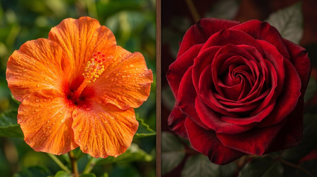
Orange or Red: Which Color Is Better? Complete Comparison Guide
Choosing between orange or red can be confusing because both colors are bright, powerful, and eye catching. They are often used in fashion, branding, design, and everyday life, but they create very different feelings and impressions.
Although they look similar and belong to the warm color family, they have completely different meanings and effects. Orange is usually connected with energy, creativity, and friendliness, while red represents passion, power, and strong emotions.
This guide explains the difference between orange and red, including meanings, psychology, uses, and how to choose the right color.
Quick Answer: Orange or Red?
Orange is a warm, cheerful color linked with creativity and excitement. Red is a stronger, more intense color associated with passion, urgency, and power.
Choose orange when you want a friendly and energetic feeling. Choose red when you want attention, confidence, or a bold impact.
What Is Orange?
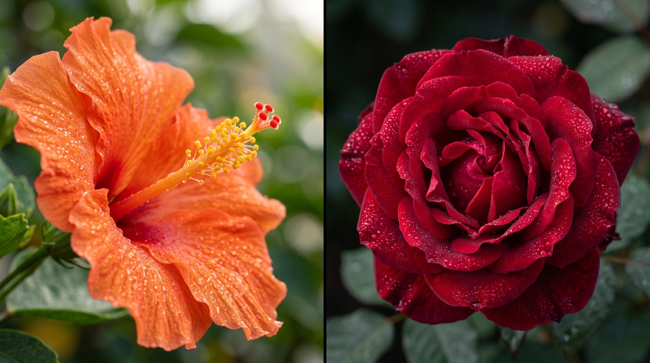
Orange is a secondary color created by mixing red and yellow. It combines the energy of red with the happiness of yellow.
Orange is commonly associated with:
• Creativity
• Enthusiasm
• Warmth
• Adventure
• Positivity
It is often used by brands and designers to create a welcoming and youthful feeling.
Orange Color Meaning
Orange usually gives a feeling of:
• Fun and excitement
• Social connection
• Freshness
• Confidence without being too aggressive
Because it is bright and energetic, orange is popular in food, sports, entertainment, and lifestyle industries.
Examples of Orange Usage
• Orange logos often suggest creativity and friendliness.
• Orange clothing can create a bold but approachable look.
• Orange decorations can make spaces feel warm and lively.
Key insight: Orange attracts attention while still feeling positive and friendly.
What Is Red?
Red is a primary color known for its intensity and strong visual impact.
Red is associated with:
• Passion
• Love
• Strength
• Danger
• Energy
It is one of the most powerful colors in human perception.
Red Color Meaning
Red often creates feelings of:
• Excitement
• Confidence
• Urgency
• Importance
Because red stands out quickly, it is commonly used for warnings, sales signs, and attention grabbing designs.
Examples of Red Usage
• Red clothing can appear confident and bold.
• Red signs are often used for warnings or important messages.
• Red branding can create a strong emotional connection.
Key insight: Red is more intense and powerful than orange.
Orange vs Red: Key Differences
Main Differences
- Red is stronger and more intense
- Orange is warmer and more playful
- Red attracts attention faster
- Orange feels more approachable
- Red can feel serious
- Orange often feels cheerful
Comparison Table
| Feature | Red | Orange |
|---|---|---|
| Feeling | Powerful | Cheerful |
| Energy | Very high | High |
| Mood | Passion and excitement | Fun and creativity |
| Attention | Very strong | Strong |
| Style | Bold and dramatic | Warm and casual |
| Best Use | Impact and importance | Friendly energy |
Real World Usage Scenarios
Scenario 1
Person: “I want a color that stands out.”
Best choice: Red
🎯 Lesson: Red grabs attention quickly.
Scenario 2
Person: “I want something happy and friendly.”
Best choice: Orange
🎯 Lesson: Orange creates a welcoming mood.
Scenario 3
Brand: “We want to look powerful.”
Best choice: Red
🎯 Lesson: Red suggests confidence and strength.
Scenario 4
Brand: “We want to look creative.”
Best choice: Orange
🎯 Lesson: Orange connects with creativity.
Scenario 5
Fashion choice: “I want a dramatic look.”
Best choice: Red
🎯 Lesson: Red gives a bold appearance.
Common Mistakes
Mistake 1: Thinking Orange Is Just Light Red
Why it happens:
Both are warm colors.
Correction:
Orange has a different emotional effect.
Mistake 2: Using Red When You Want Calmness
Why it happens:
Red looks attractive.
Correction:
Red is intense and attention focused.
Mistake 3: Using Orange for Serious Messages
Why it happens:
Orange feels positive.
Correction:
Red often works better for urgency or importance.
Memory Trick
Remember Red
Red = Reaction
It creates a strong reaction.
Remember Orange
Orange = Optimism
It feels bright and positive.
Expert Insight: Color Psychology Difference
Orange and red are both warm colors, but they influence perception differently. Red creates a stronger emotional reaction because humans naturally associate it with importance, energy, and warning signals.
Orange balances excitement with friendliness, making it less aggressive and more approachable.
Designers often choose between these colors based on the message they want people to feel.
Conclusion: Orange or Red?
- Choose red for power, passion, confidence, and attention
- Choose orange for creativity, warmth, happiness, and friendliness
- Red is stronger and more dramatic
- Orange is brighter and more approachable
If you want a bold impact, choose red. If you want a cheerful and energetic feel, choose orange

